The bottled water industry is booming these days, raising by almost 10% just last year. It provides an easy and efficient way for people to make water portable and is accessible almost anywhere you go. The industry also claims that bottled water has the added benefit of being "healthier" for you than regular water. Many people find this information misleading and choose to boycott bottled water altogether. Alternatives such as canteens (which are now highly marketed) are being used as substitues for the bottles themselves, with the use of tap water. To many bottled water is a huge waste of natural resources and gives misleading facts about the "health benefits" that bottled water provides. Just last year Americans consumed 8.3 billion gallons of bottled water, about 26 gallons per person. 86% of those bottles become garabage or litter, ending up in landfills where they are either burned, emitting toxic fumes into the environment, or buried, where they take up 1,000 years to biodegrade. To produce enough bottles to acquire to America's demand, 1.5 million barrels oil are used annually. Aside from being extremely unsustainable, bottled water has shown to have no different health affects as tap water according to a study by the Natural Resources Defense council. Some bottled water is spring water, but most is tap water with added minerals (that have to been to proven to have no health benefits). The report actually showed that there are more regulations governing the quality of tap water than there are governing the quality of bottled water. Recycling bottled water is said to help ease the environmental burden that bottled water poses in the first place, by conserving energy and renewing resources. Unfortunately, studies have shown that not enough of the bottles (a mere 23%) are actually recycled. The energy saved in recycling these bottles doesn't even add up to the energy that needs to be used to renew them. In parts of the world where natural water is scarce, bottled water is a potentially ingenious idea, providing people with clean, drinkable, portable water. When that water is being mass distributed to people who have access to clean drinking water everywhere they go, it is safe to say that we are being very wasteful and unsustainable.
http://www.pmmag.com/Articles/Feature_Article/BNP_GUID_9-5-2006_A_10000000000000120137
http://science.howstuffworks.com/environmental/green-science/bottled-water4.htm
http://agreenliving.net/bottled-water-controversy/
http://www.earth-policy.org/plan_b_updates/2007/update68?gclid=CNyQhYfl36wCFcbd4AodPFhvpA
Wednesday, November 30, 2011
Wednesday, November 16, 2011
These are my superimposed images. I decided to present them as a prototype of a building that Graft International has designed. This building is obviously not a real building, but a prototype. My sign was too small to actually be building marker anyways so that is also just the prototype for a larger sign.
These are a few of the pictures that I took of my sign on a building. I wasn't allowed to actually adhere it to the wall of any of the buildings that I went to so I ended up going the convention center downtown and hanging it on the grooves in the wall. Obviously, they dont look very professional or exciting so I decided to superimpose my sign on found images of modern architecture.
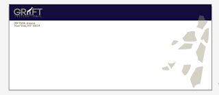
This is the envelope template that I used to create my envelope. I found it online but it had another company's information on it so I traced around it with the pen tool and outlined it in a light grey color with a very fine line. I printed my giraffe print on the other side of my 11x17 ivory 24 lb paper (which took forever to find! They ended up having it at Fedex office.... not michaels, ac moore, the post office, staples, or office max)
I made this to test print colors on the ivory paper that I chose. I ended up using my original color combination but printed it at staples instead of the school printer. I find that the laserjet printer at staples lays the color on top of the paper very crisply whereas the epson at school allows the paper to absorb the ink. My "international" type was getting lost because the color was bleeding into it and the colors looked really washed out in general. I literally printed 30+ test prints before I got my final results.
These are my final business cards that I chose to use. They are not much different than 2 that I had originally designed. I made the giraffe print opaque, realigned my text, and took the giraffe print off of the front that I initially had. I also ended up printing this card on ivory paper to stay consistent with the rest of my designs.
Tuesday, November 8, 2011
wall mount logo
I printed these logos out in size 5"x7" to insert into my glass wall mount. They are interchangeable.
Tuesday, November 1, 2011
Graft Letterheads
These are the Graft International letterheads that I have created so far. Upon looking at these, I think that I have decided to go with the darker color scheme. I think that the 4th one is the most successful so far.
graft business cards
These are my Graft International business card designs. I haven't decided exactly which one I am going to use yet as my final. I am still deciding on my final color scheme. It will all depend on how they turn out when I print them on ivory colored business paper.
Subscribe to:
Comments (Atom)


